
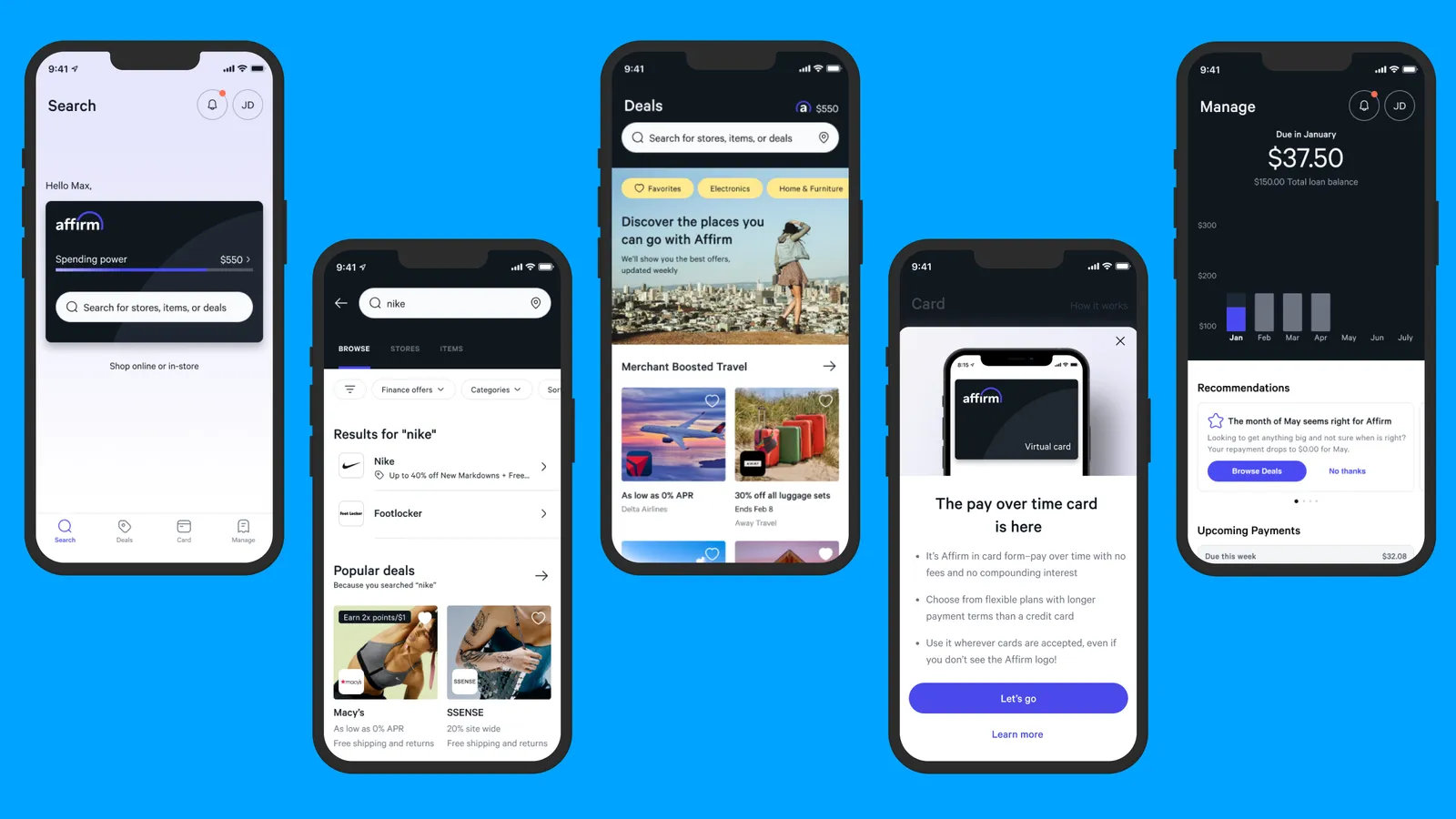
I led a team of 7 product designers, content designers, and user researchers in a rapid-pace wholesale redesign of the consumer Affirm app to drastically rethink the customer experience, how we partner cross-functionally as a team, ship incrementally, and design in a way that elegantly marries customer and business needs.
The result of this effort was a “north star” conceptual prototype currently being prioritized across various horizontal teams at Affirm. This prototype reimagines the consumer experience, pushes the envelope of our design system, and even draws the attention of the C-Suite and Founder of Affirm.
Design Team:
Product Design Manager (me), 5 Product Designers, 1 Content Designers, 1 User Researcher
Skills:
Leadership, Creative Direction, People Management, Influence, Collaboration & Problem Solving, Project Planning & Management
Project Duration:
4 months (inception – future vision)
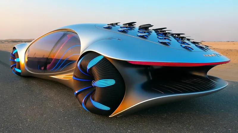
Project Akira was a “concept car” of the future.
So, what exactly is “Akira”?
That is a fair question. Akira, by definition, means “Bright, clear, and ideal.” This perfectly embodied the spirit of this prototype. It all started with emails sent back and forth between Affirm’s CEO and the Head of Design. Max, the Founder, suggested that we were at an inflection point as a company, and we needed to do something to reinvigorate our app or get lost in the shuffle of our competition. Our consumer usage of the app was down, and the repeat growth rate was stagnant. We needed ideas, and we needed them fast.
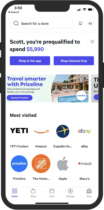
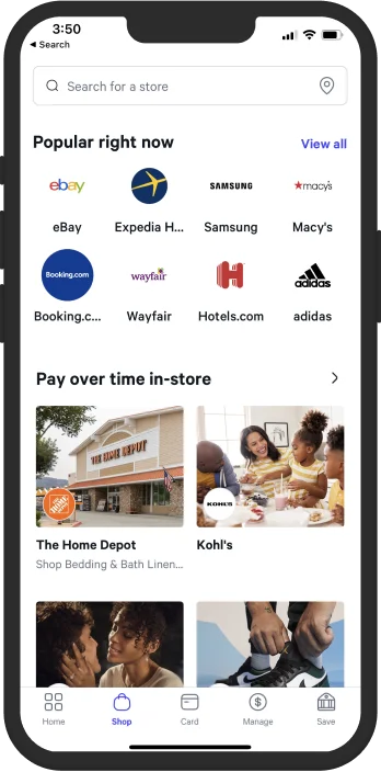
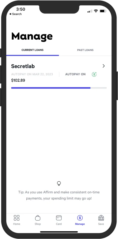
The “SuperApp” was not so super…
The Consumer Problems
The Affirm app has millions of daily users, but it has become a “SuperApp,” that is to say, an app where everything exists but with no logical order. As I became involved in the conversations around this work, I identified multiple opportunity areas we could tackle with a redesign. In particular, they were:
- Duplicative and unengaging content – There were many areas of overlap in the app and a general lack of content that would drive transactions (thinking about shopping and deals, specifically).
- One size fits all design and inefficient routing – There was no personalization or segmentation based on audience type.
- Lack of habit-forming behavior – There was no way we were encouraging re-transaction at critical moments, which led to very little reuse of the app for repeat transactions.
- Long iteration cycles – There was lots of organizational bloat, which led to inefficiencies when shipping our product.
We decided to get a tight-knit group of designers to tackle these problems and to do so swiftly. Not only was Akira a revamp of our consumer app, but it was an opportunity to collaborate closely with executive leadership (as this had their attention) and show that there are more efficient ways to ideate than sitting in meetings all day long every day. My team was selected to spearhead the venture, as we were newly formed and focused on consumer growth and retention.
The Approach & Experimentation Plan
We focused on five key improvement areas of the app through a few brainstorming workshops with leadership. The output solutions were:
- Refresh the app IA to enable efficient routing
- Improve the app performance and interaction design
- Segmentation and introduction of contextually relevant content
- Investing in personalization to increase stickiness
- Building habit-forming loops that encouraged repeat behavior
The working team acquired the approval of an experimentation plan that rolled the updates out to 1% of our customers to learn and further iterate. In parallel, we would run user research on the app for deeper qualitative feedback.
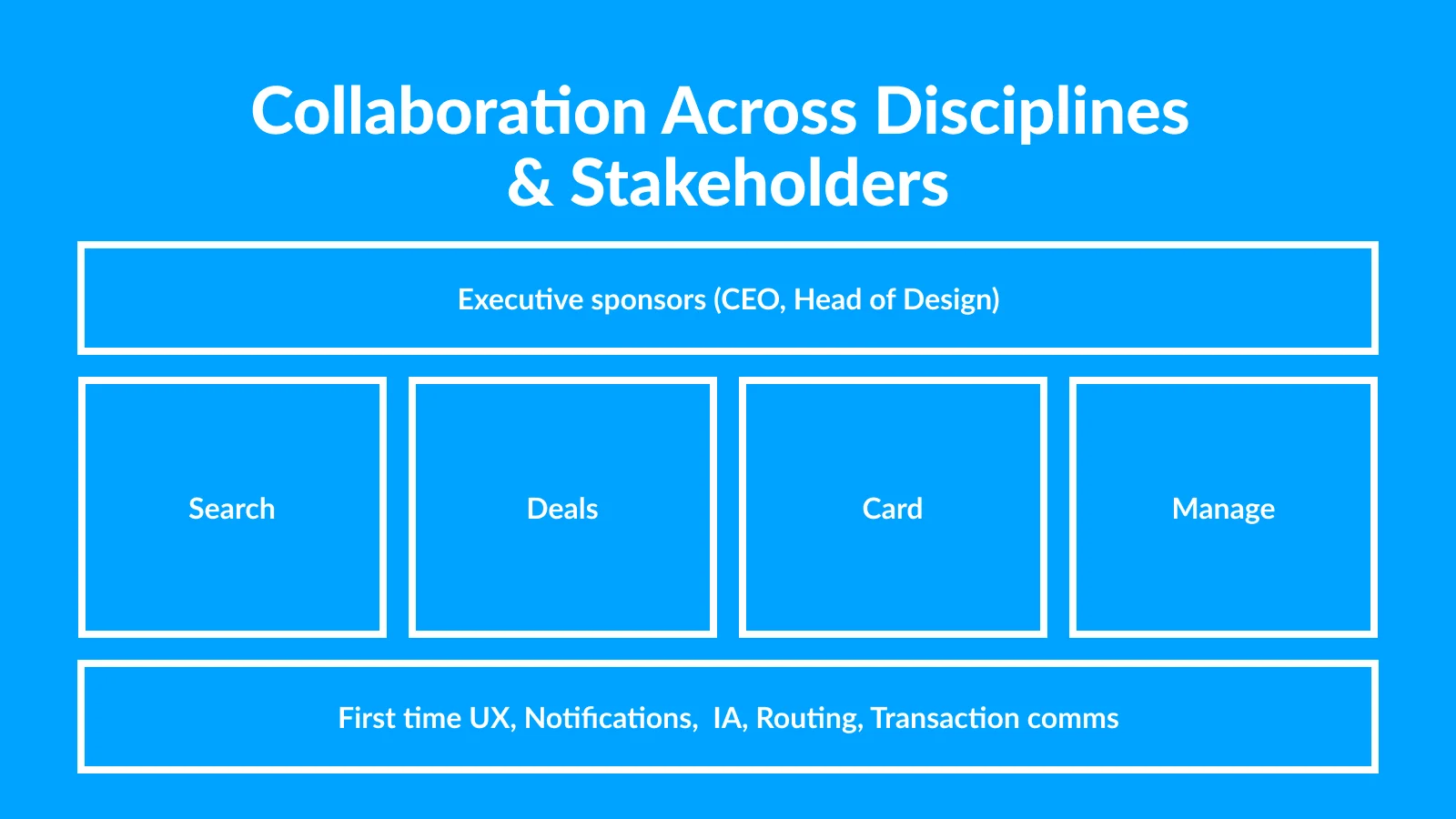
The Akira consumer app working group breakdown. One app, yet lots of design problems to tackle!
As the work progressed, I quickly realized that the working team needed to include designers from my team, subject matter experts, and teams focused on our app’s Search, Deals, Card, and Manage tabs. 7 Product Designers, User Researchers, and Content Designers worked on this initiative over four months.
You’ll notice I only mentioned a little collaboration with Product or Engineering partners. This decision was intentional – we chose to cut out layers of organizational employees in a decisive effort to move fast, explore the blue sky concept, and then figure out exactly how we roll this out more formally.
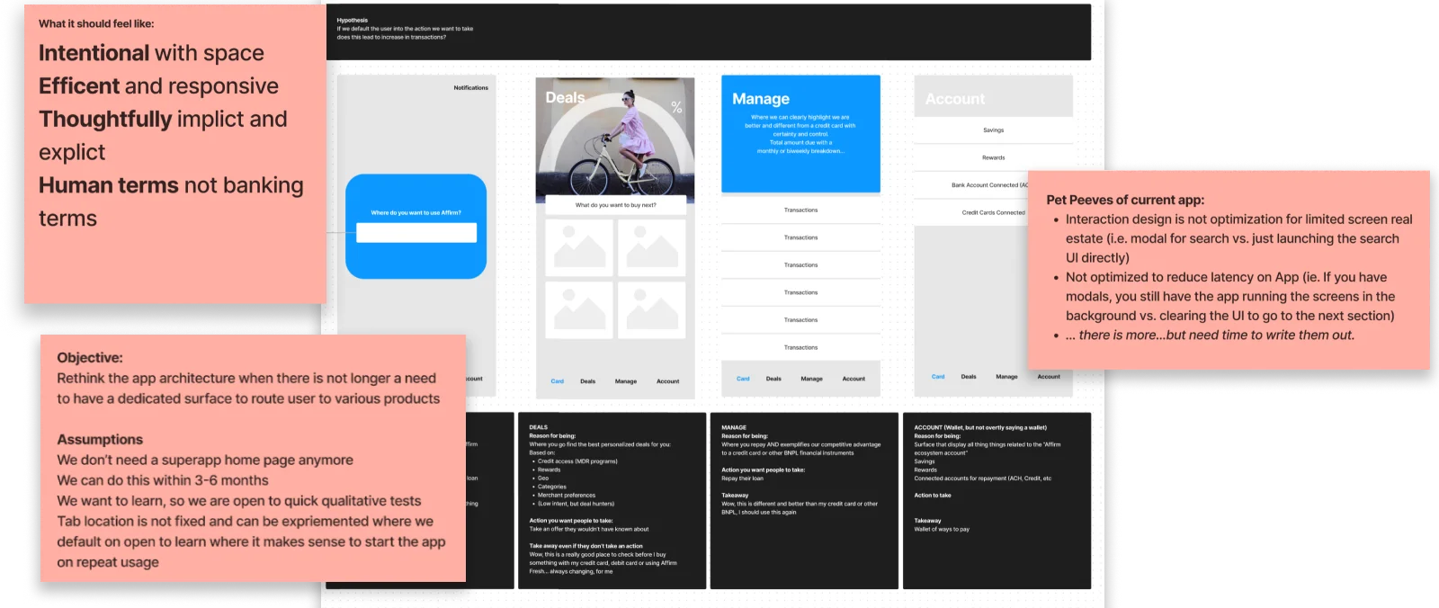
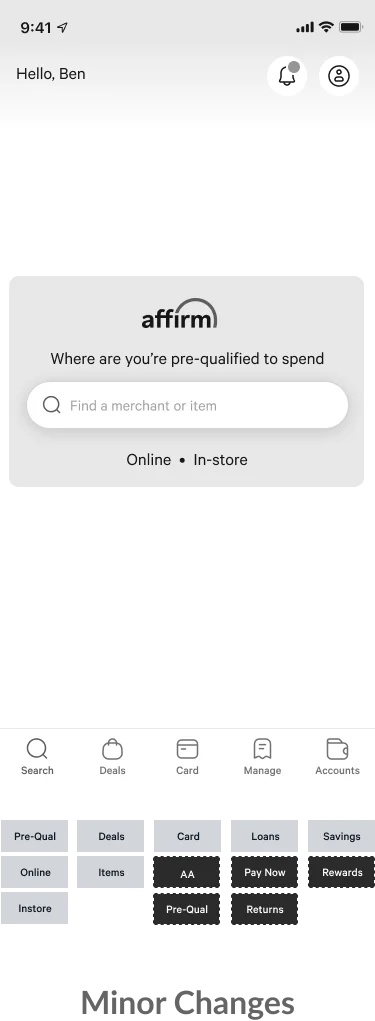
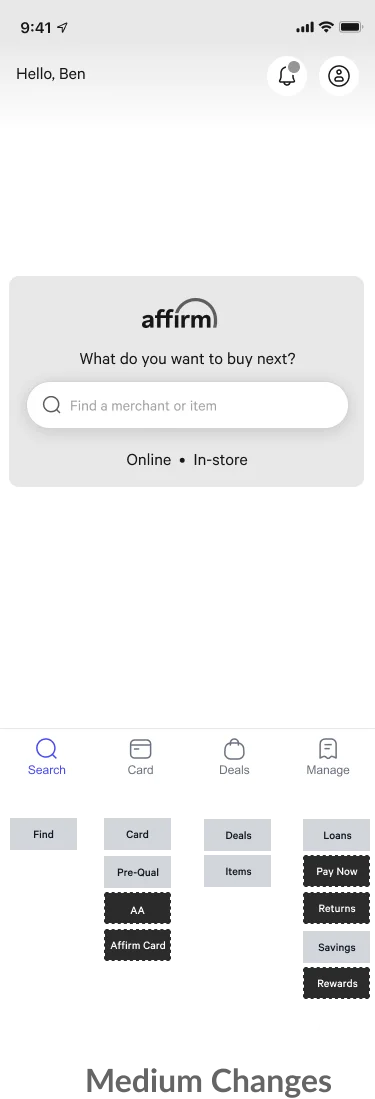
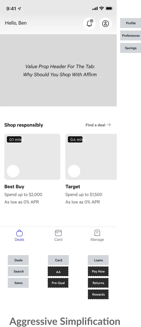
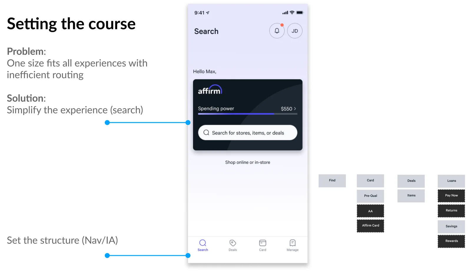
IA updates and overall explorations.
Putting the Plan in Motion
I kicked the work off by facilitating a virtual whiteboarding workshop where we discussed the strengths and opportunities of the current app, our assumptions, and how the new updates should feel to a customer.
From there, we did a lot of exploration around the overall IA – we knew that organizing our information more meaningfully and less duplicative way would lead to much stronger outcomes. We explored three approaches – minor changes, medium changes, and aggressive simplification. Ultimately, everyone agreed the aggressive simplification (3 tab) approach would be ideal. Still, given the extent of the changes and the impact on the company, it made more sense to take a streamlined approach that emphasized “search” as a JTBD, resulting in a four-tab IA in the app.
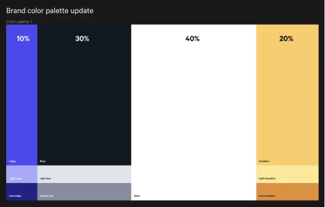
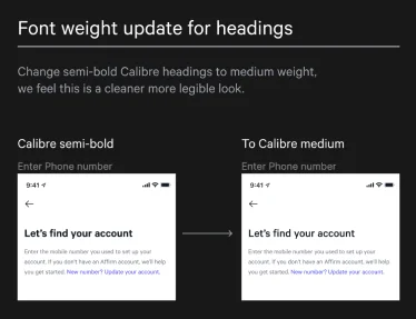
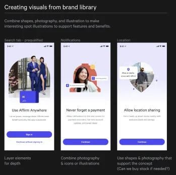
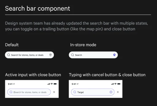
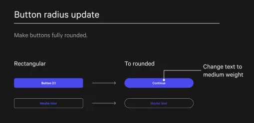
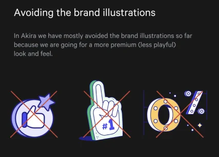
Proposed design guidance for Akira patterns, mixed with Brand guidelines.
Design System Influence
As we went along, we kept in close contact with both the brand and design systems teams. Brand was in the middle of a refresh of the .com look and feel, and we wanted to ensure that our app decisions aligned with theirs. This collaboration worked well as we shifted from a playful, lighthearted look and feel to a much more refined, premium experience.
As we navigated these conversations, I worked closely with our design system lead to ensure the system could account for large-scale changes. We discussed how we might roll the changes out sequentially and establish simple updates for the rest of the organization to utilize as these features rolled live.
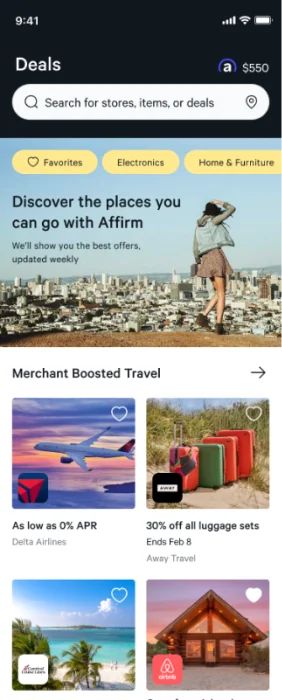
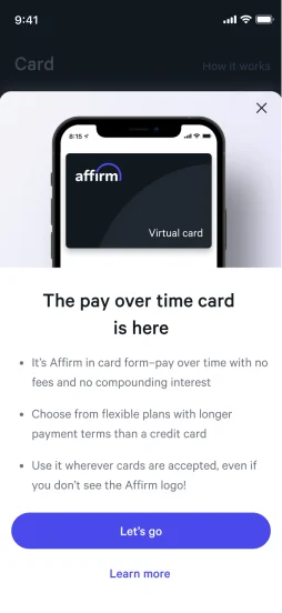
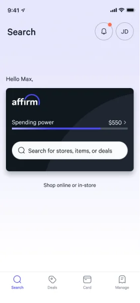
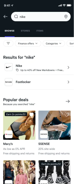
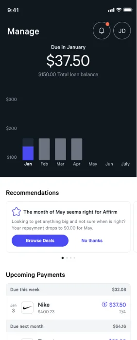
The final Akira experience.
The Final Deliverable
After a very focused 4-month timeframe, the cross-functional design team delivered a working prototype of a wholly rethought consumer app. We presented to executive leadership, outlining the new focus on a clear IA, a crisp search at the forefront of the app, a more feature-rich shopping experience, a renewed emphasis on the Affirm In-Store Card, and a rethought Manage experience that encouraged re-transaction at critical moments (such as paying off a loan).
The executive team, including the Head of Design and CEO, were impressed with the deliverable. The broad mission of rapidly creating a prototype that could be used as a lens for the year’s work ahead was a success.
The Akira animated prototype.
The Impact & Results
Our results were threefold:
- We proved to ourselves and the company that we could work more nimbly and efficiently with fewer “cooks in the kitchen” early on and loop a broader group in later in the process. This is not to say that we shouldn’t work cross-functionally, but rather that we should be selective of who we include and at what point to enable rapid ideation.
- We created a new, consumer-first experience to be experimented with and tested to drive more app usage and repeat sales.
- We worked closely with the brand and design systems team to drive forward a new, more mature Affirm brand, mirroring where we were as a company.
As of this writing, we’re in the middle of bringing stakeholders into the loop that are required to sequence, prioritize, and ship the deliverables the team outlined.