
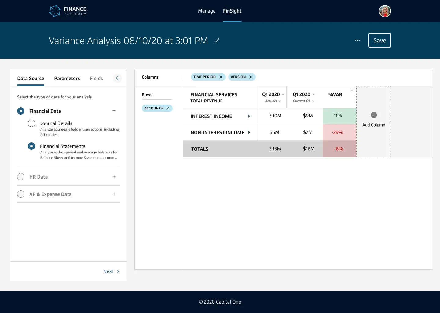
I led a team of 3 designers building the “Analyze” experience of the Finance Platform at Capital One. This work helped Finance Analysts at the company optimize their routinized analytic tasks. They could aggregate previously disparate data, rapidly query massive databases, and quickly surface insights by manipulating and customizing their data. We achieved this through a foundationally solid experience, aesthetically pleasing UI, and a standardized design system framework.
My role on this project was as creative director and manager – leading the team and advocating for design quality, system usage, the ideal user experience, and managing relationships with our Product and Tech partners. The result met user and business needs and laddered to our OKRs.
Design Team:
Design Manager (me), 3 Product Designers, 1 User Researcher
Skills:
Leadership, People Management, Product Design, Design Systems, Collaboration
Project Duration:
9 months
The Agency Life
Initially, the Finance Platform was outsourced. It’s a bit comical that a company with 600 full-time designers uses design agencies for anything, yet when things need to move swiftly, agencies appear. In its infancy, the Finance Platform was outsourced to a third-party vendor who designed various experiences on an ad-hoc basis. Unfortunately, the vendor met the immediate needs but did not think long-term or holistically – to them, this was a contract, not a platform. In the end, the long-term vision was not met with their delivery, and sub-part designs were pushed to code. Mix this with the utilization of a hodgepodge design system, and the Finance Platform needed a significant overhaul. Enter the Finance Platform design team.
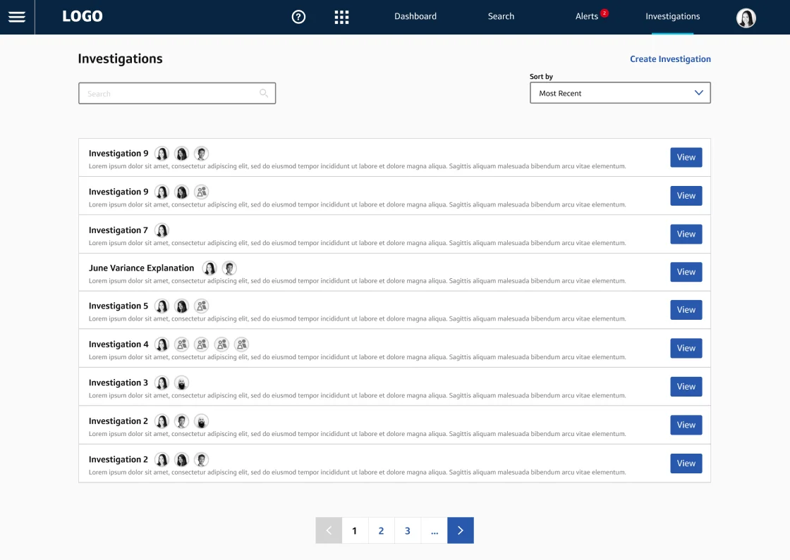
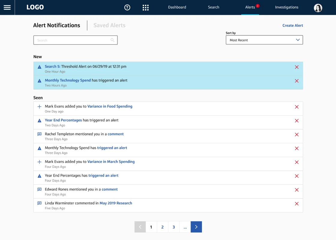
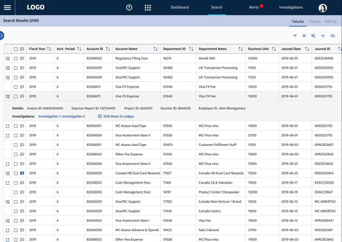
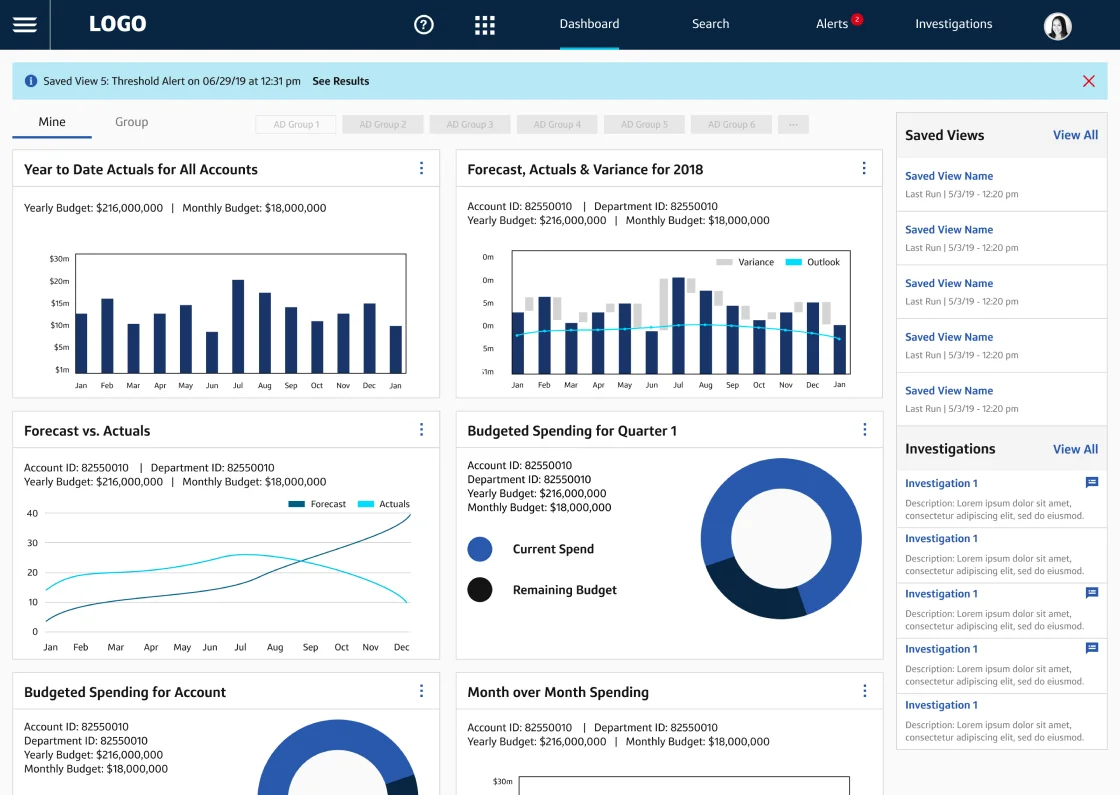
A few examples of the agency work that was delivered. General research was performed via a workshop, and high fidelity designs were delivered next. The design system used here was “XDS”, a relatively untested system specific to one team at Capital One.
Soon after the agency exited its contract, the On-Demand Finance organization at Capital One allocated funds to spin up a proper design team. In late 2019, I was one of the first designers to join this new team. Our mission was to create a fantastic series of experiences for our users that would ladder to the newly dictated Platform mindset the company was to push forward. The goal was to literally transform the way Finance associates did their daily jobs, to retire antiquated processes, and to fundamentally change how Financial data was managed, predicted, analyzed, and communicated to stakeholders.
As 2019 unfolded, the team grew to 15 full-time designers, including leadership. We divided the work into four primary sectors (or workstreams): Manage, Analyze, Predict, and Communicate. Given the amount of work early on, I was heavily involved with Manage. Over the long term, Analyze was the workstream that I owned from start to finish.
The primary KPI in Analyze was to help Financial Analysts improve their routinized, day-to-day workflows and rethink how they approached their work. We brought together transaction-level and summary data and allowed analysts to surface insights on anomalies in trend data, explore individual transactions, and discover variances in data such as actuals and the financial outlook.
As we began our exploratory work, the first thing I kicked off was a new workshop – one that would help us investigate the user and business needs and start driving a new solution.
Uncovering the Needs
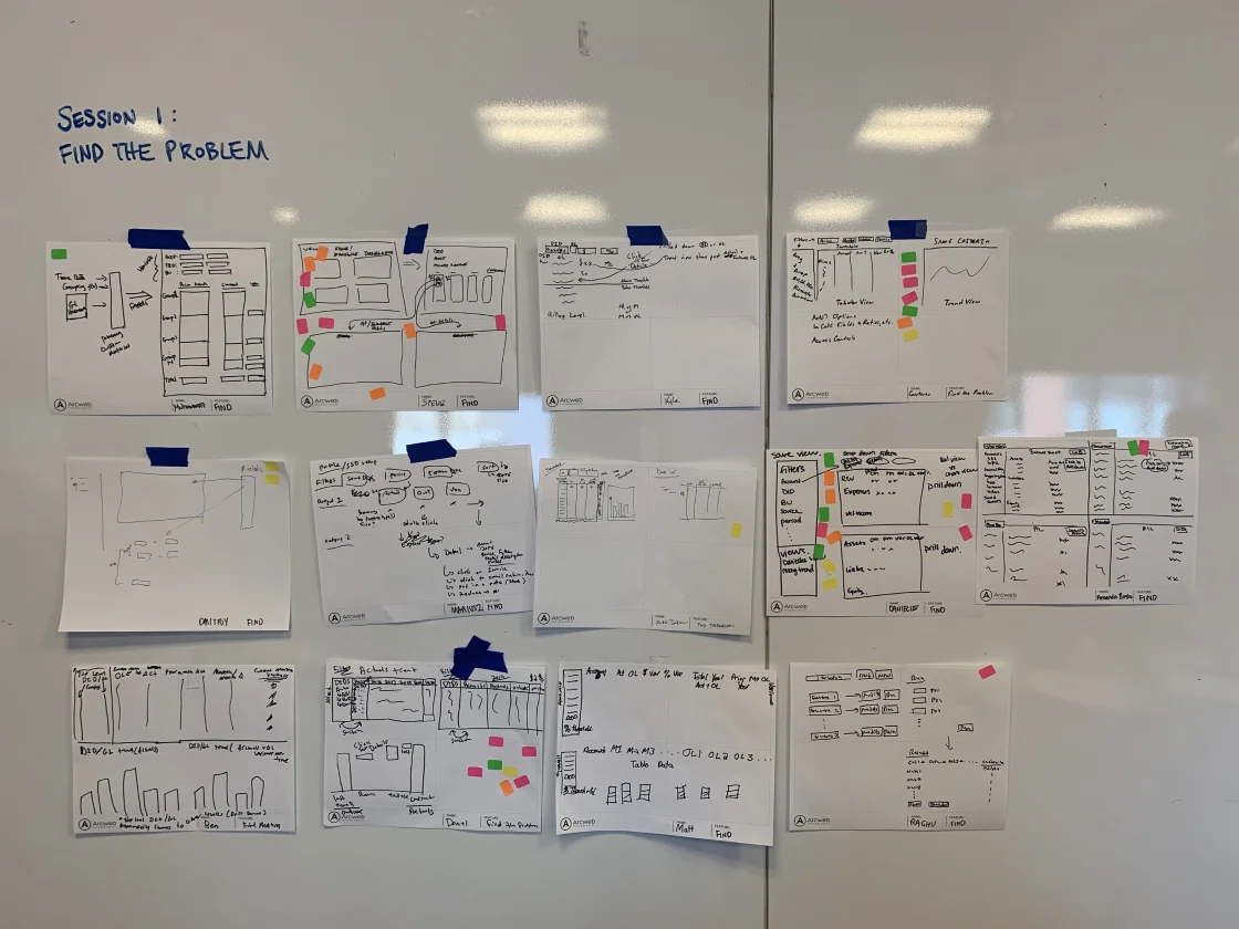
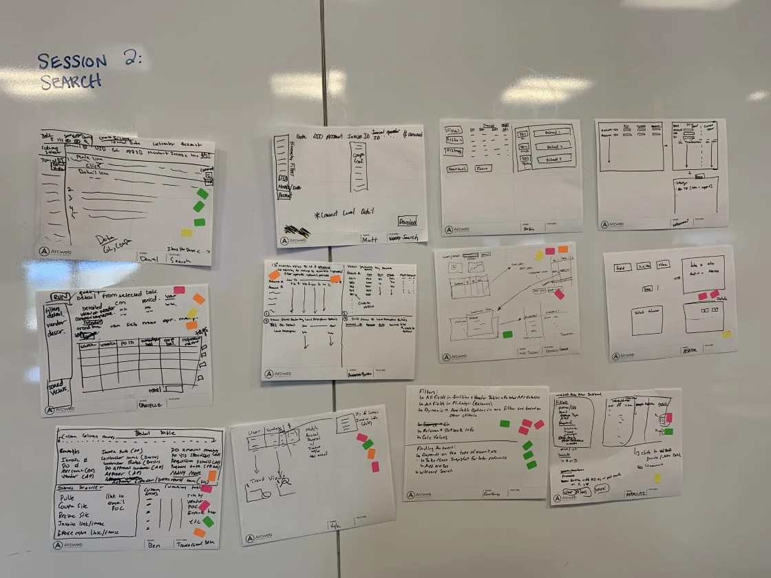
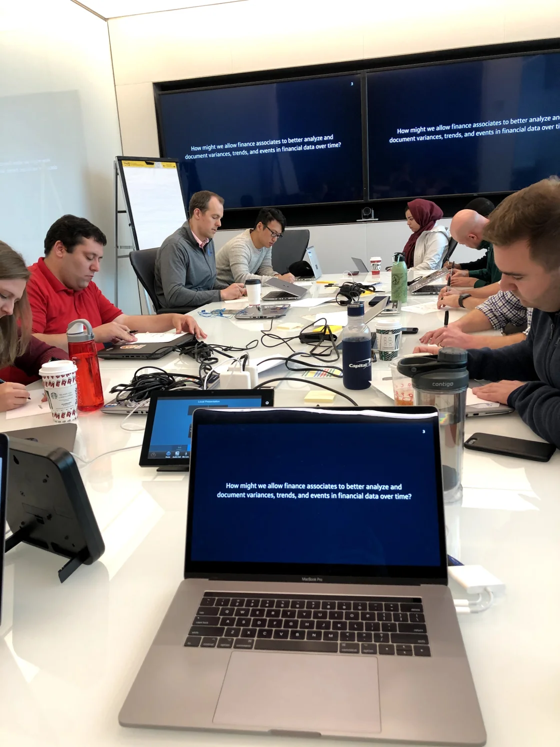
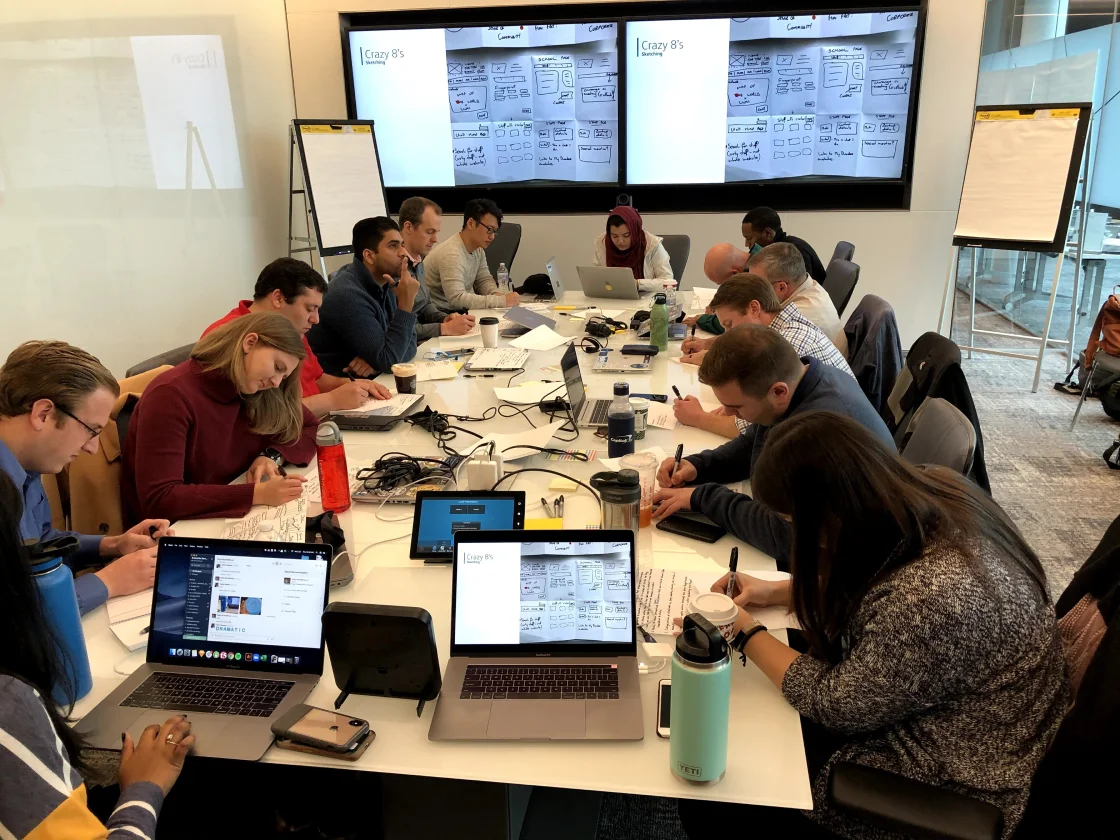
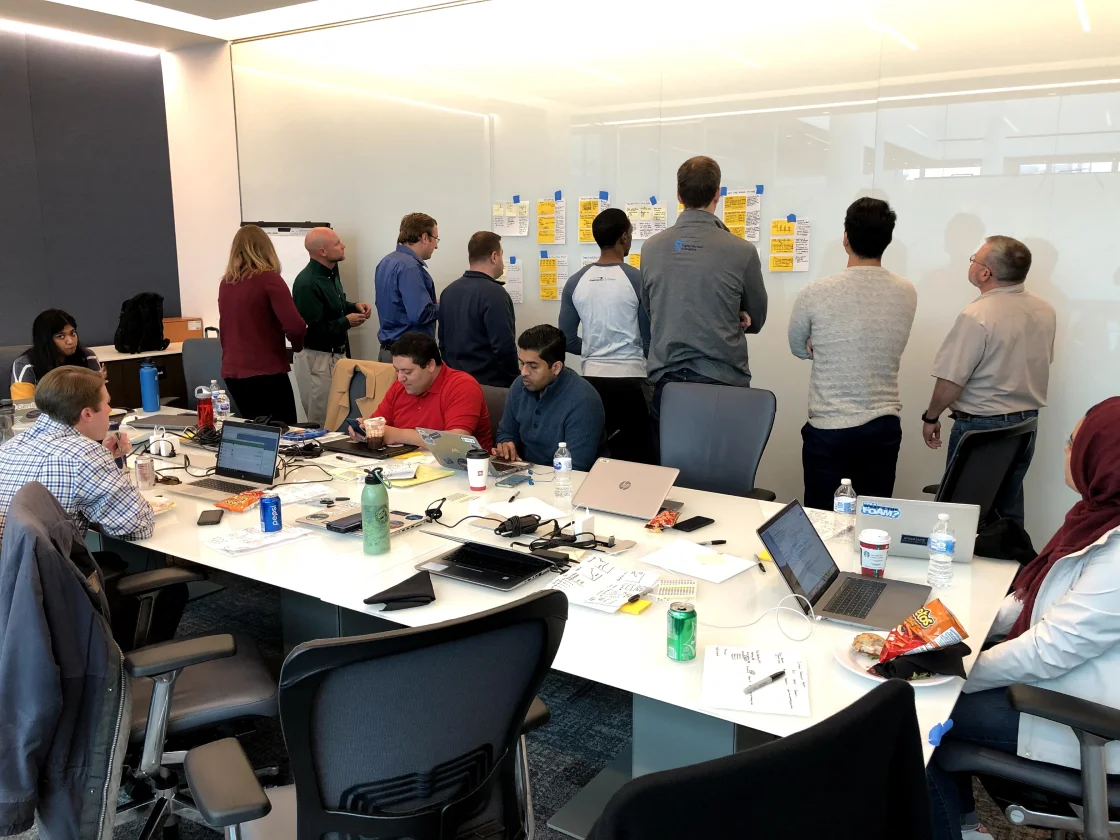
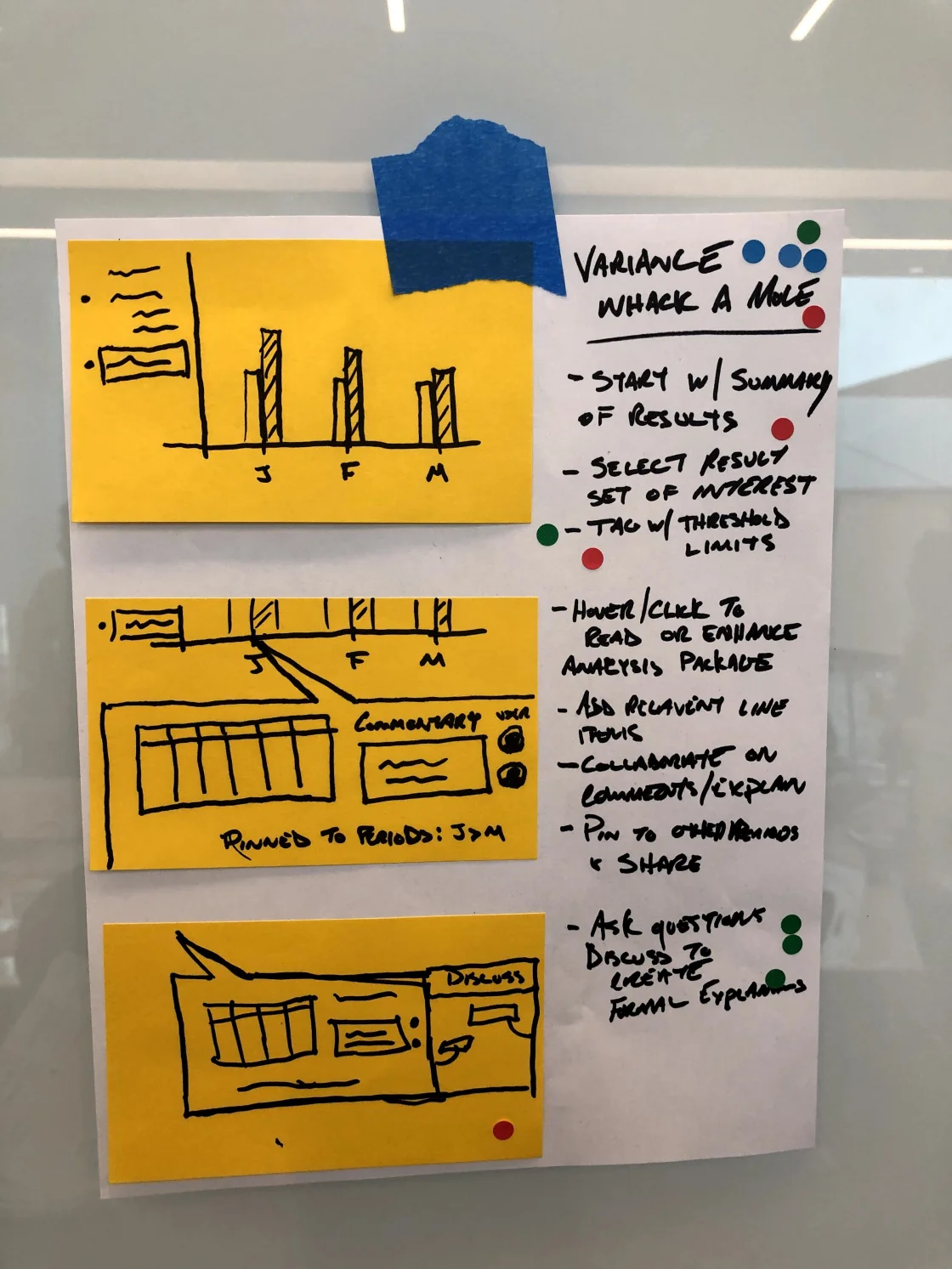
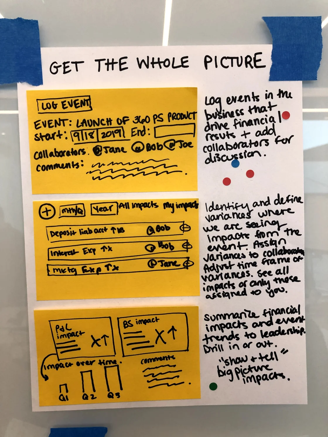
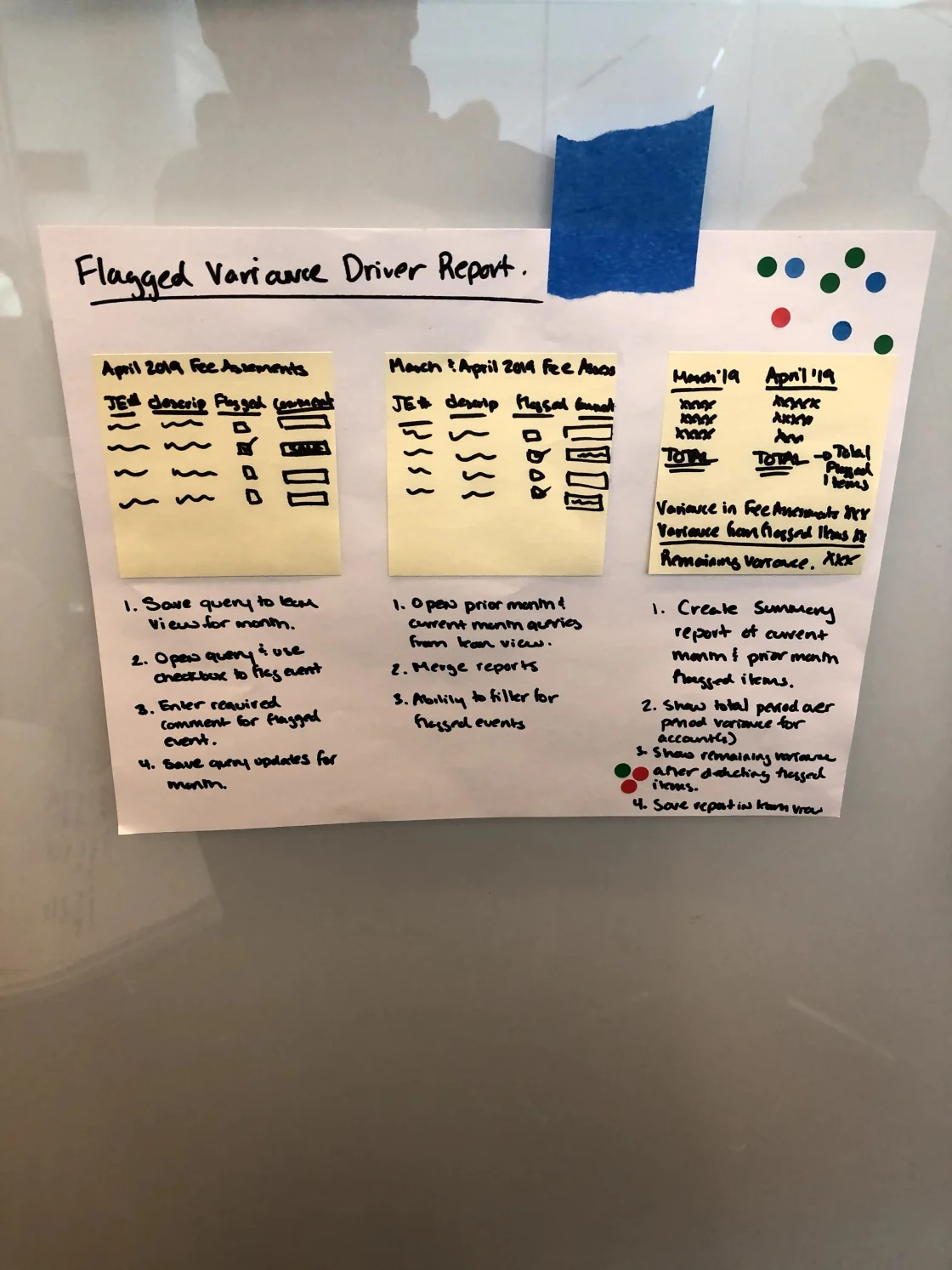
The primary goal of the kickoff workshop was to uncover the user and business needs. We utilized the now famous “Jobs to be Done” framework to discover the heart of what this audience was after while leaving things open-ended and not prescribing a solution.
Throughout the day, we followed a variety of exercises from the typical Design Sprint format, including Crazy 8’s and Solution Sketching. After much dialogue (and a bit of pizza), we left the workshop with a stronger understanding of how to move forward. Critical findings included the need to access data that previously lived in multiple tools (sometimes taking hours to query) and allow them to traverse summary and transaction level data immediately in one interface. Other desires included visual indicators of variance, the ability to pivot data in a multitude of ways, and precisely customized tables to the exact user’s need.
After downloading the information we learned, my team built out a user journey map that covered various steps in the process, as well as the high-level Jobs to be Done that they would be achieving.
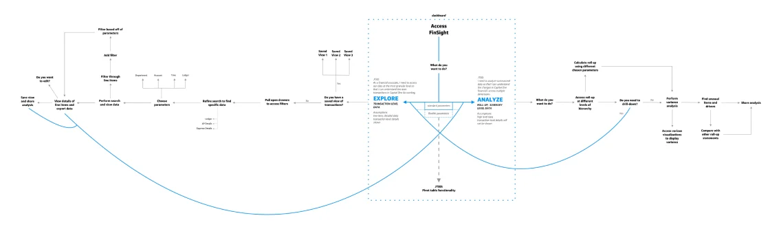
The output of the user journey work the team produced. Users could traverse data at a transaction and summarized level.
Next, we were ready to tackle some low-fidelity mockups to start giving the experience shape. The team focused on speed here – they worked in Balsamiq to quickly get ideas to me for feedback. During this time, we had weekly critiques, as well as meetings with Product & Tech partners to keep them involved early and often. This ensured that we kept on track with the business needs and allowed the Tech team to vocalize concerns or questions regularly.
Once we had a good framework for the designs, we did some evaluative testing to start seeing how users would react to them. We incorporated heuristic reviews to quickly gut-check and make sure the designs would hold up well to tried-and-true UX principles. We also did one-on-one usability tests to make sure users were able to navigate and understand the designs easily.
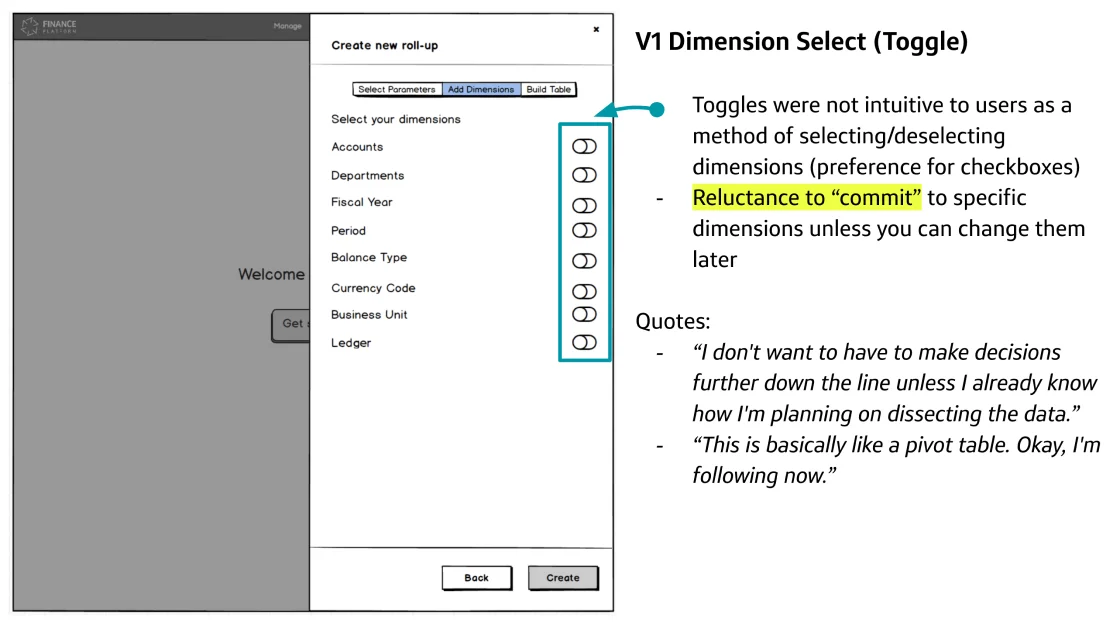
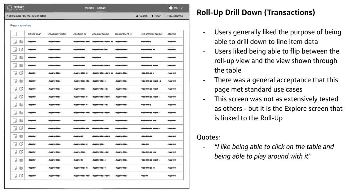
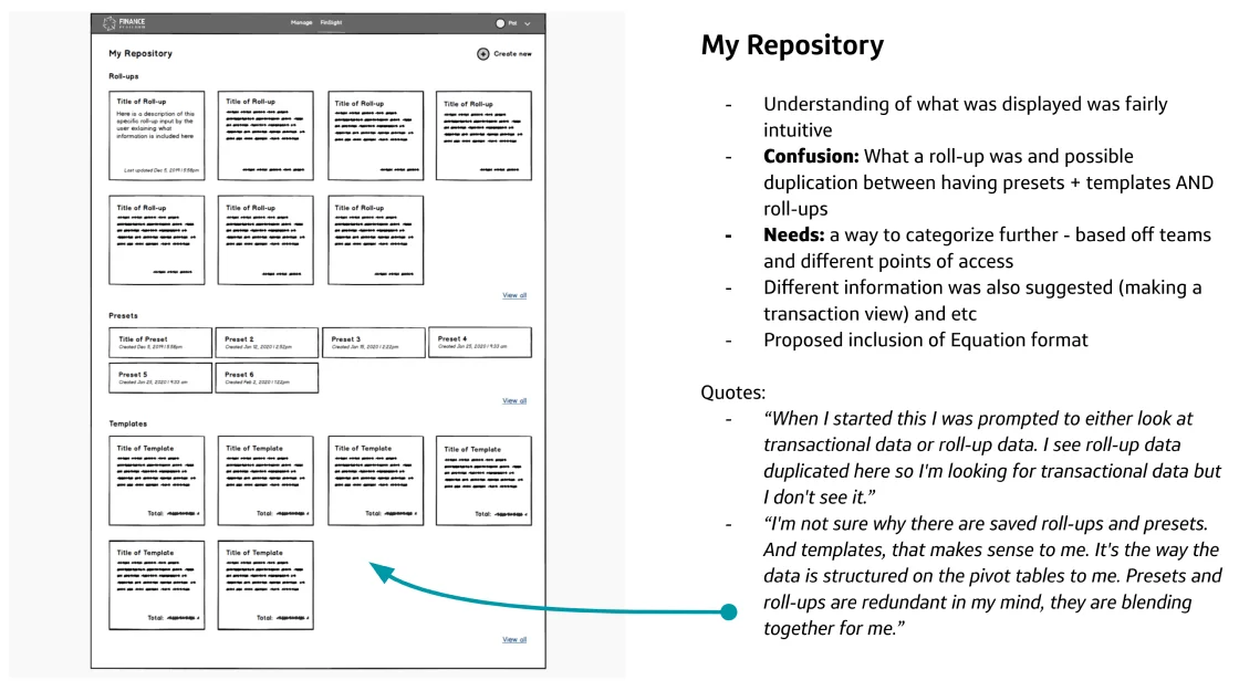
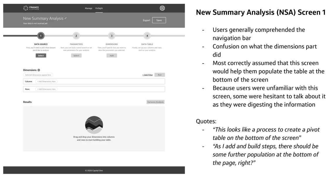
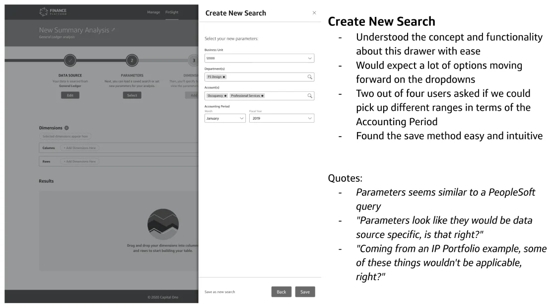
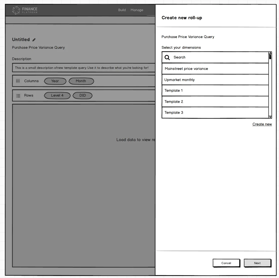
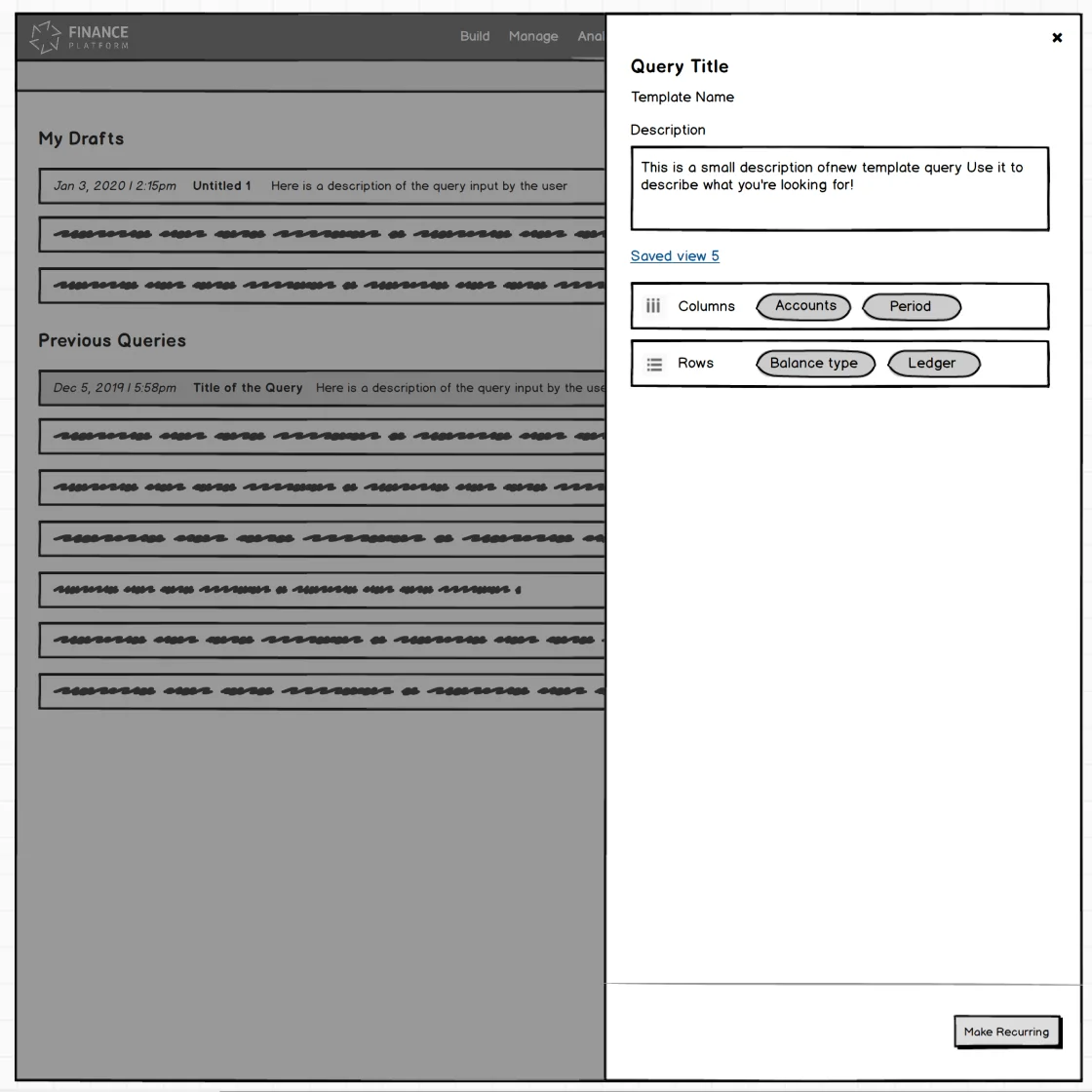
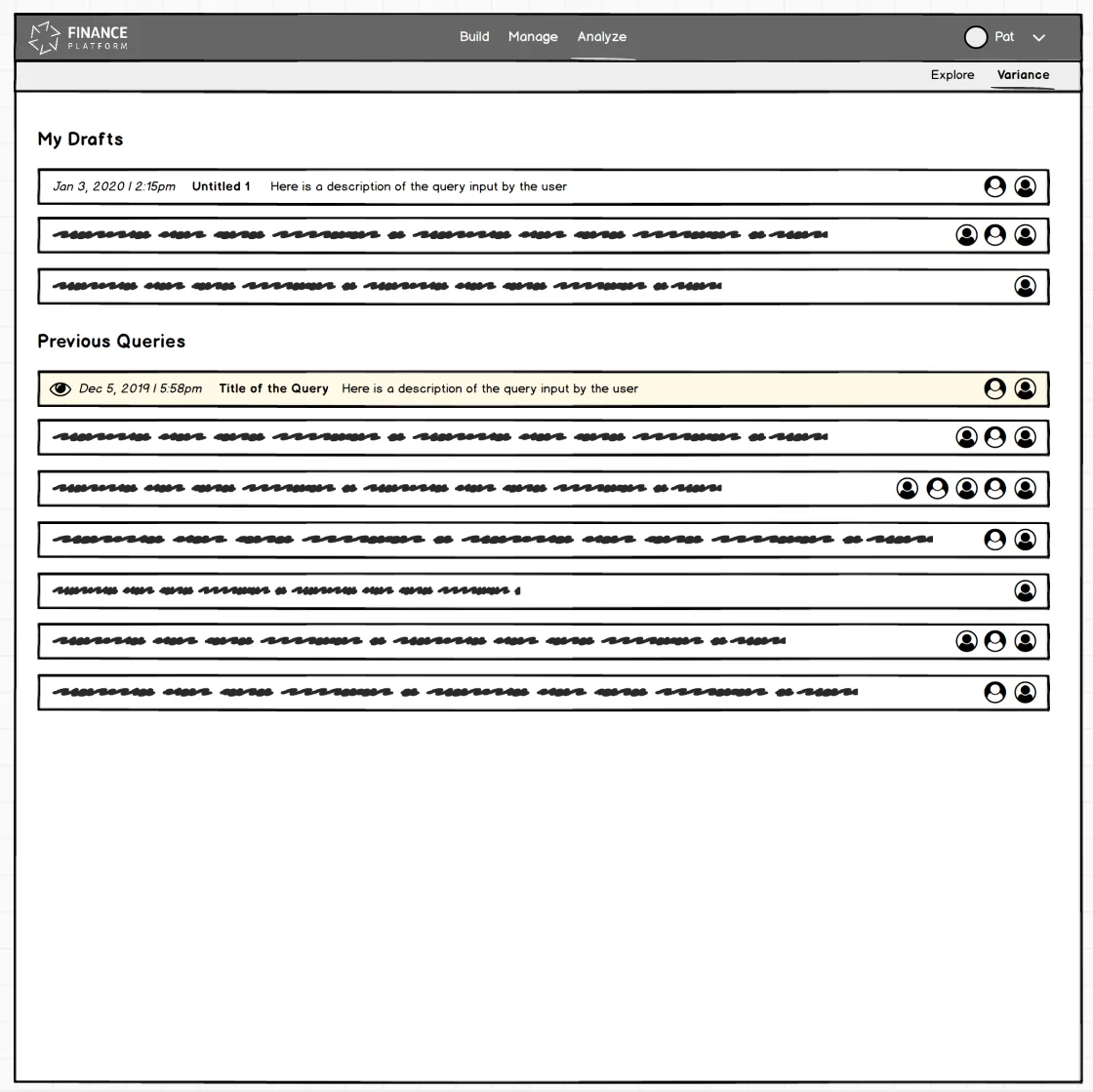
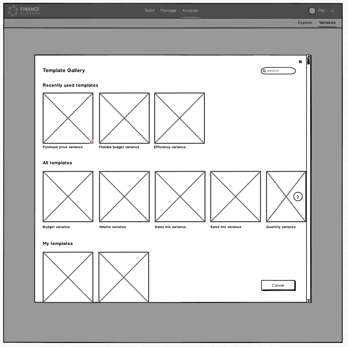
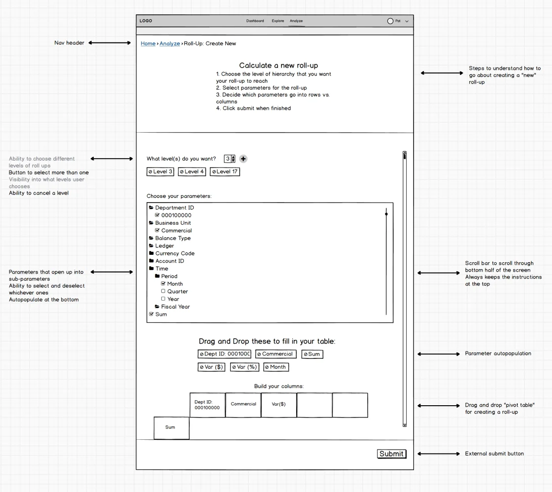
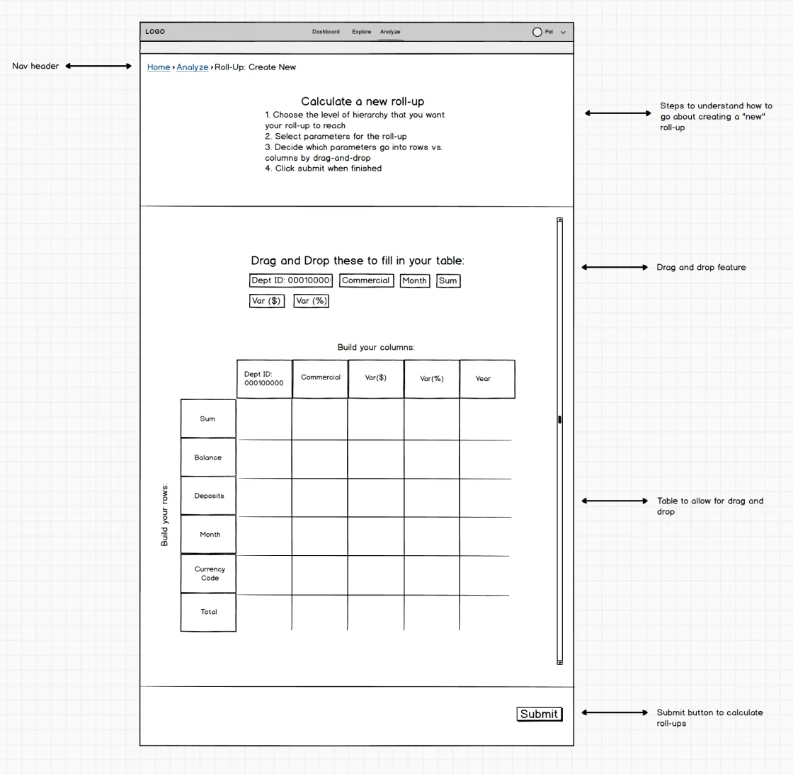
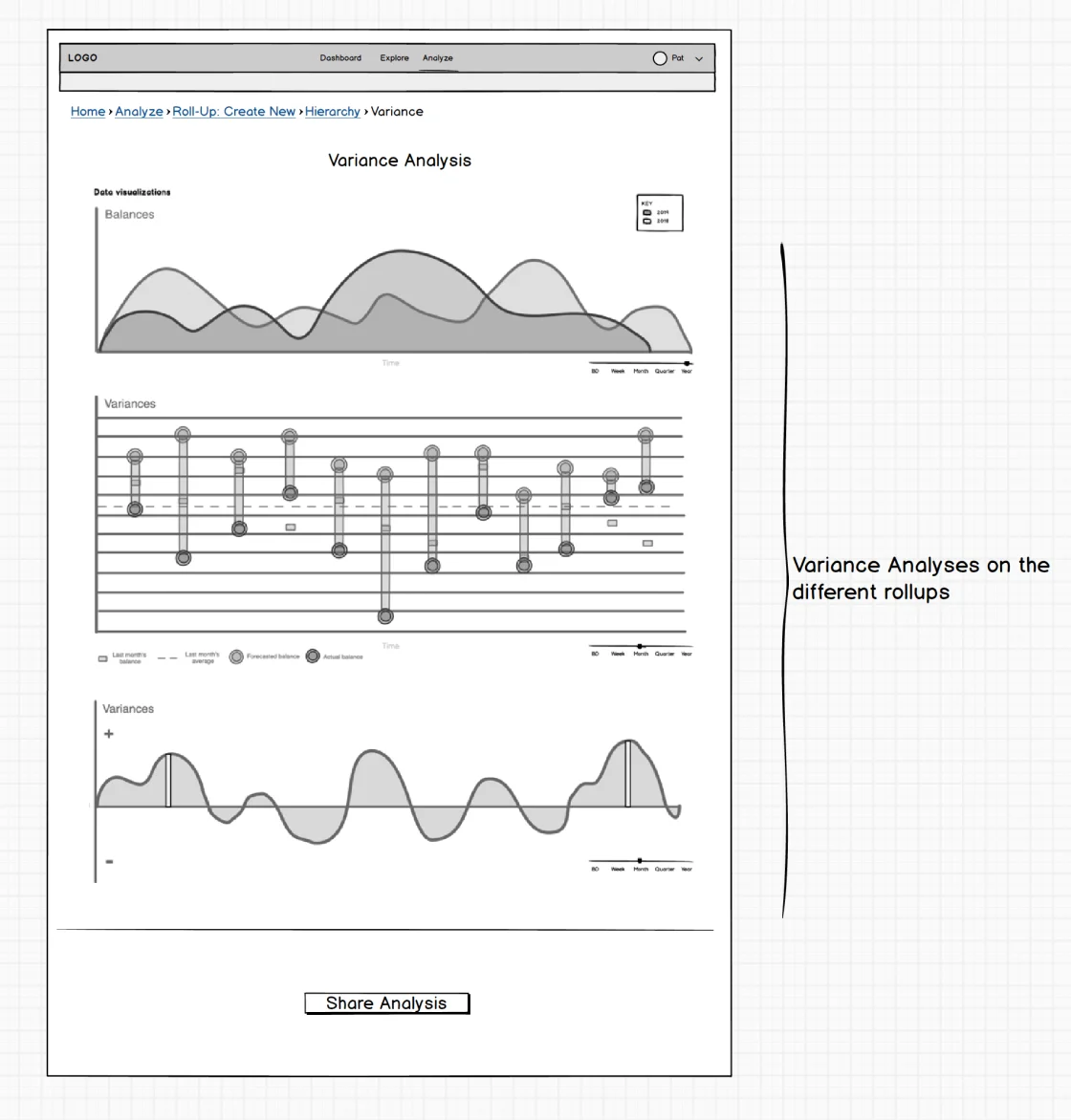
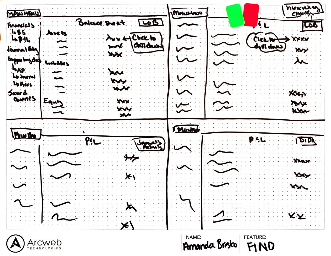
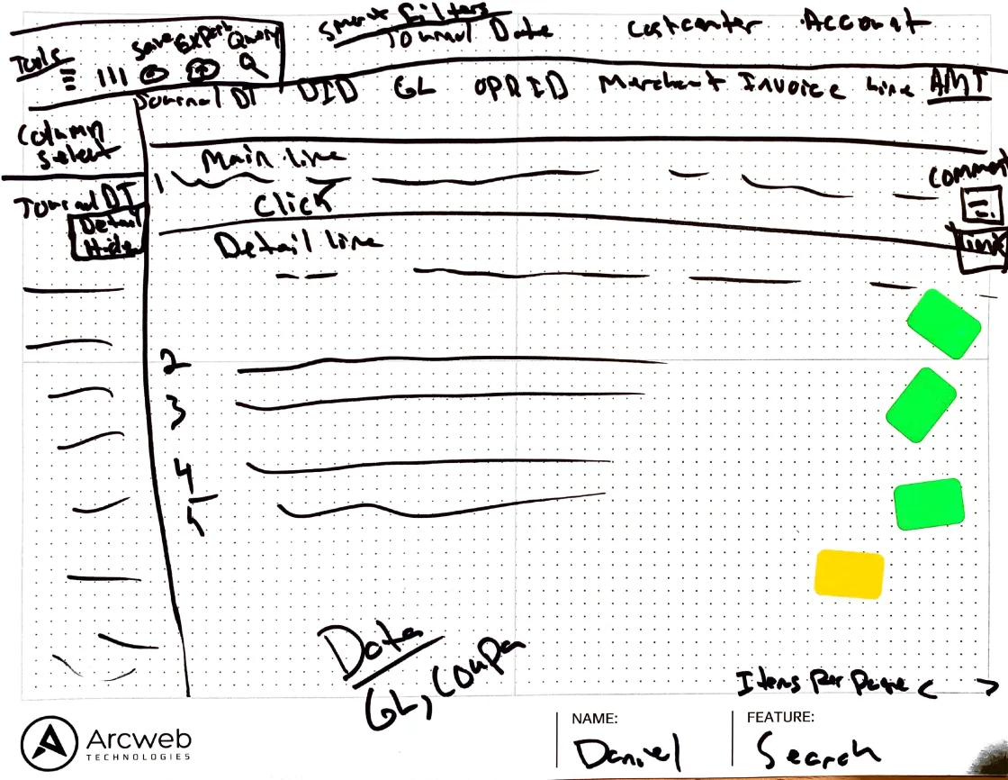
Some of the mockups that were created at various stages of completion. The goal here was speed and quality of ideas.
Scaling Up
Through various iterations, critiques, collaboration with partners, and evaluative research, my team scaled up the designs. Once the Balsamiq mockups were properly vetted, they moved the designs into Figma and went to mid-fidelity. The Transaction, Trend, and Variance experiences are all built on one another, so it was interesting to see the iterations progress. There were points where Transaction was in a good spot, yet as we progressed on Trend, we came up with better ideas and retrofitted them to the previous experience. By the end of the process, we had a solid UX foundation that kept the customer at its heart.
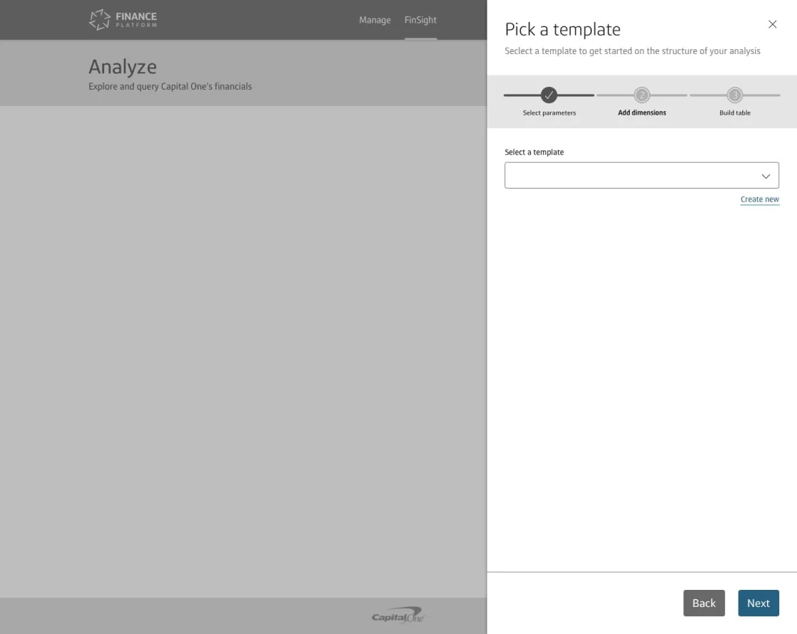
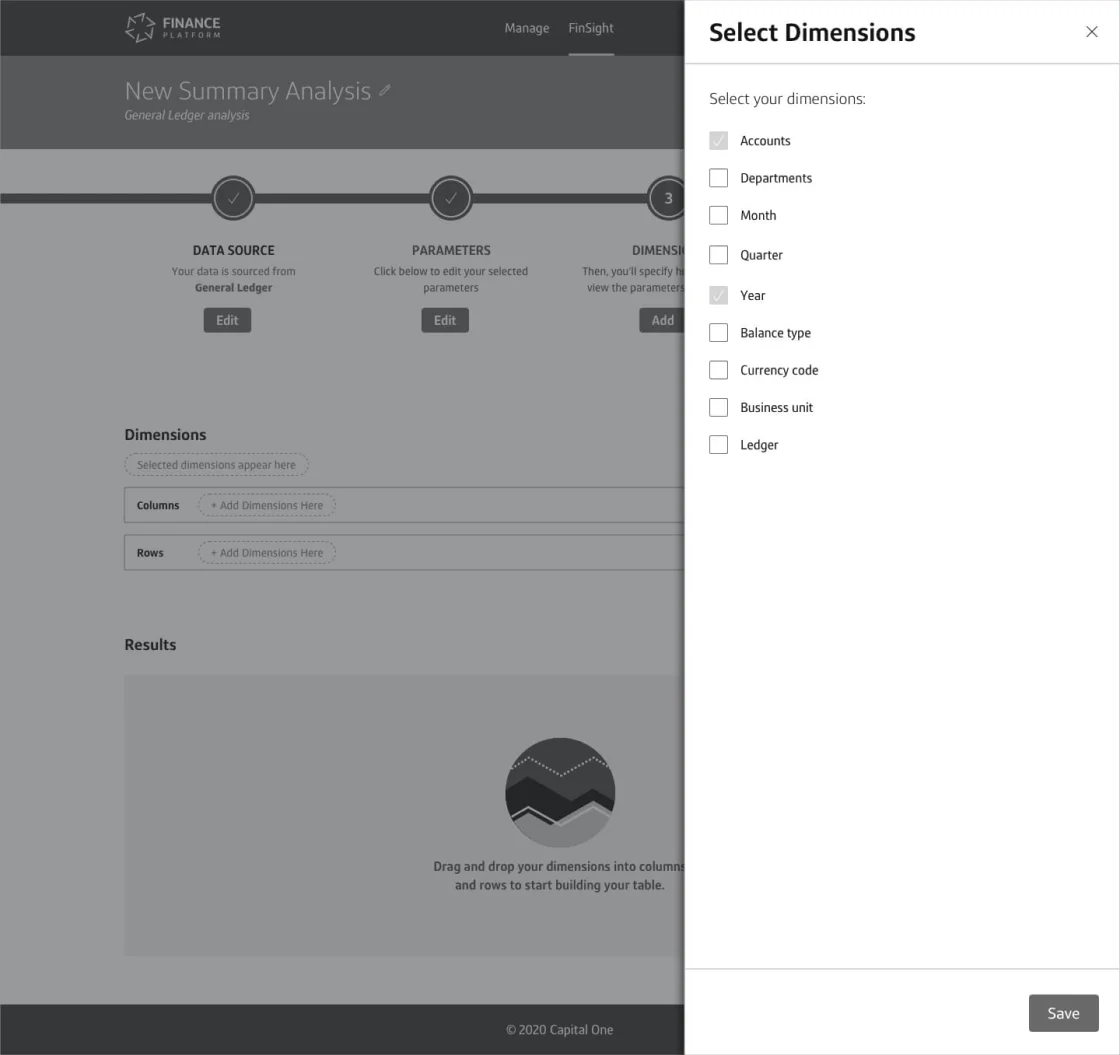
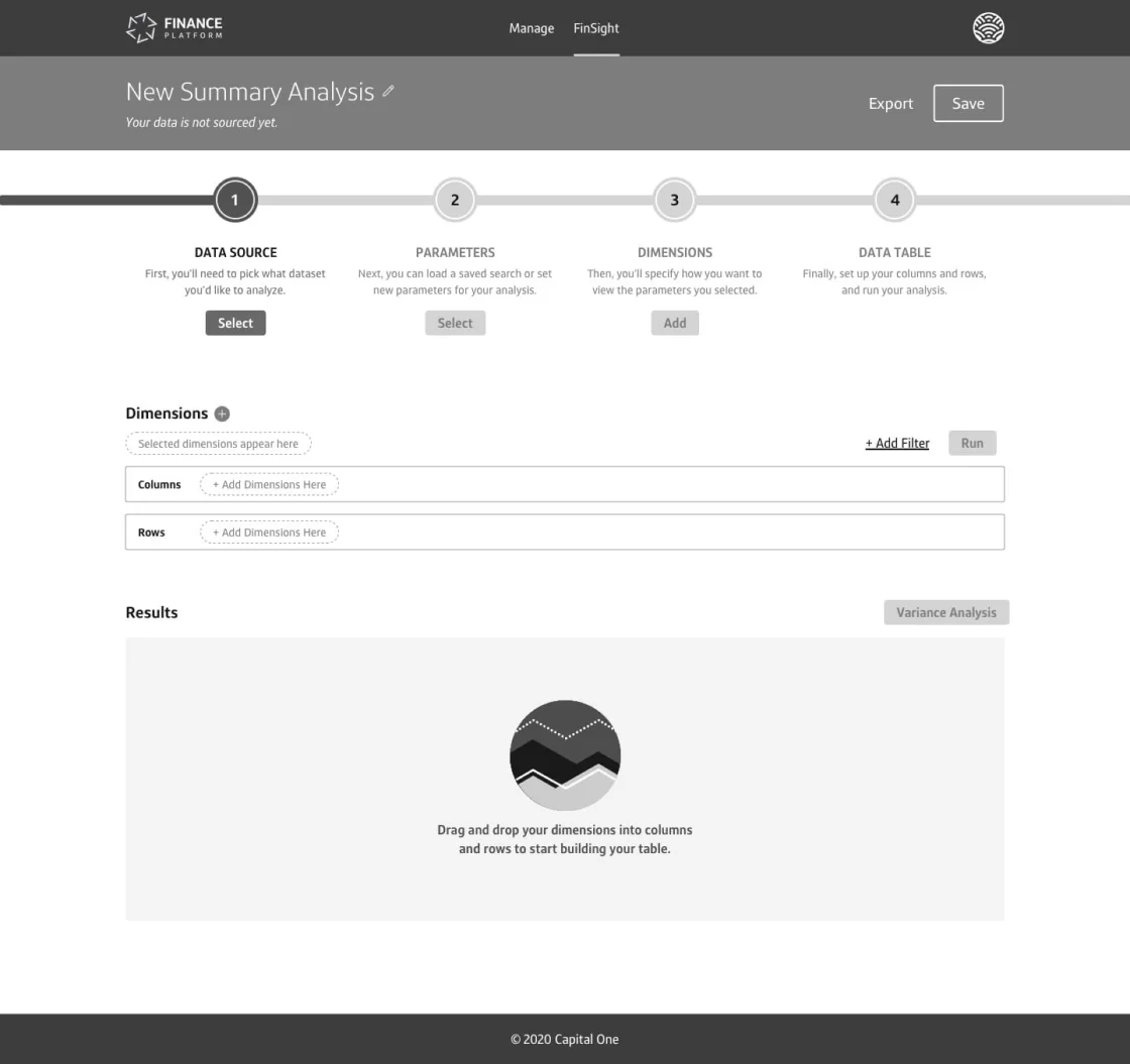
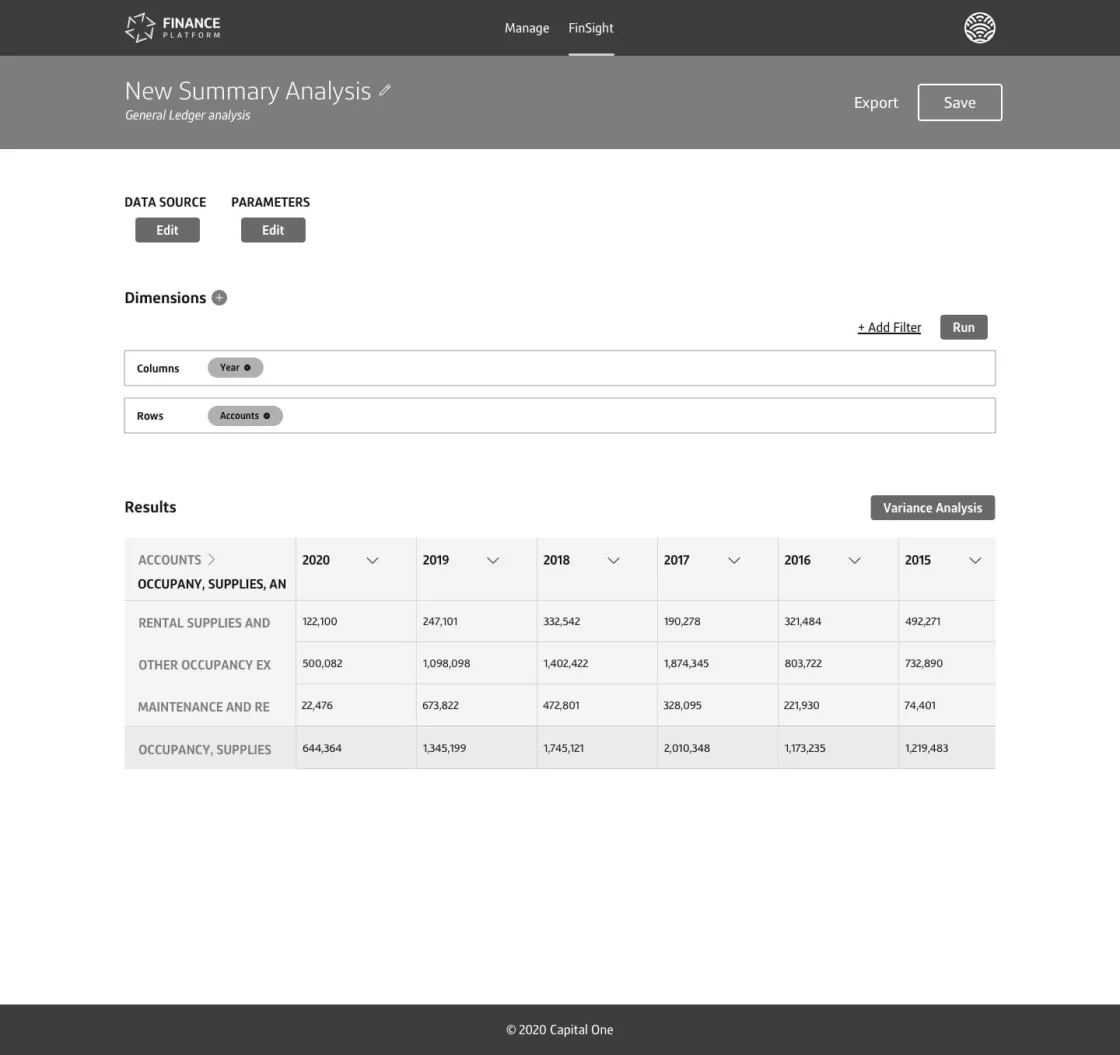
A few examples of the mid-fidelity designs that were eventually scrapped and improved upon.
One exciting meeting that we had monthly was what became known as “FXR,” or “Finance Experience Reviews.” This meeting had a massive audience, typically 30+ attendees ranging from Senior Associates to MVPs in Finance. These were always slightly unnerving, as attendees were unafraid to share their feelings, but the feedback was generally constructive. My team presented several times at these for many months, and the feedback was helpful.
After mid-fidelity was approved and we felt solid about the direction, we started building high-fidelity. At Capital One, this meant leveraging the official design system, Gravity, and bringing color and pixel perfection into the mix. I brushed up on Gravity foundations, as I had used it many times before rolling onto the Finance Platform. I guided my team in best practices and helped steer them in the right direction where appropriate.
There were moments, however, when Gravity was not built out enough for our purposes. In these instances, we met with the Gravity design team for guidance. Generally, they’d review work and give it a go or no-go. Eventually, we scaled across the entire Finance Platform enough that we had to create custom components – Gravity was focused on the simple external website and app, and we were developing complex internal experiences that were data-heavy. As such, my designers spearheaded a Finance Design system that utilized Gravity as its base but expanded on component functionality as needed and documented the reasons for those. At the time of this writing, this is a large effort that my team is pushing forward as the broader Finance Design Team has more and more instances where designing in silos can be an issue.
At the end of this process, the design team and I prepared files for engineering acceptance. Everything was ready for delivery, and throughout the entire endeavor, we worked in Dual Track Agile – always remaining a few steps ahead of our Engineering partners.
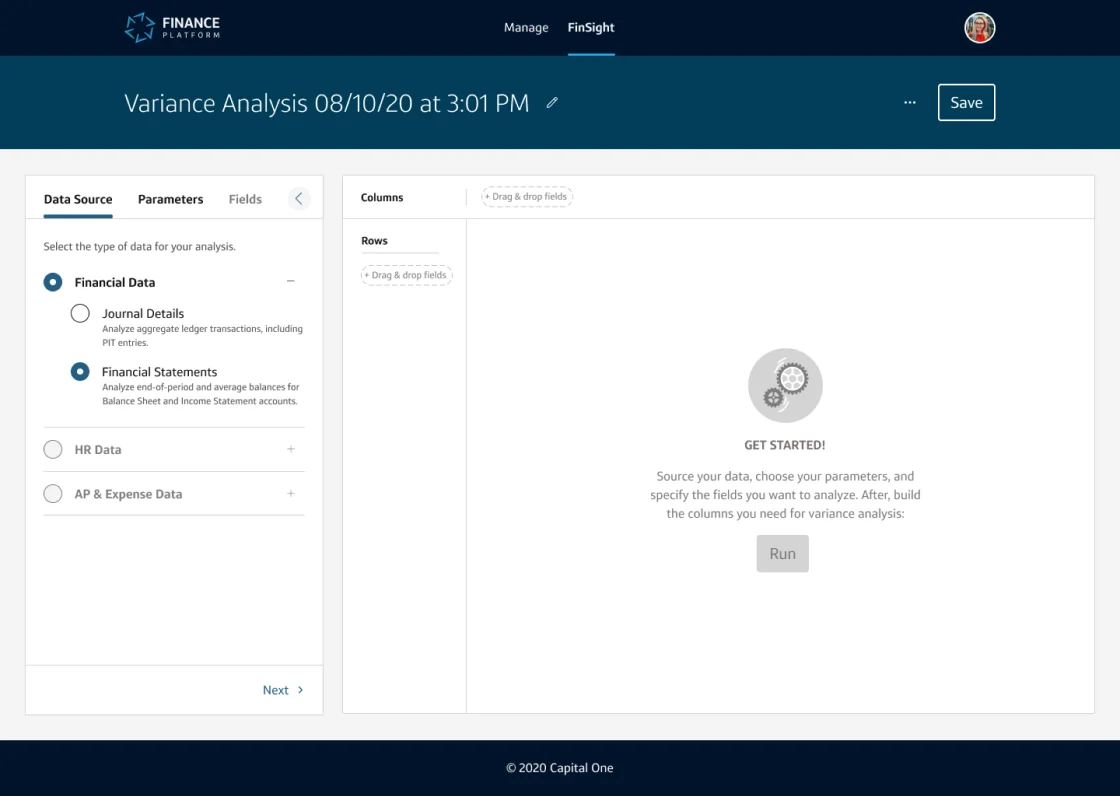
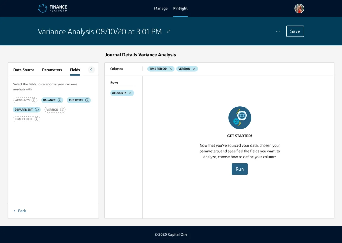
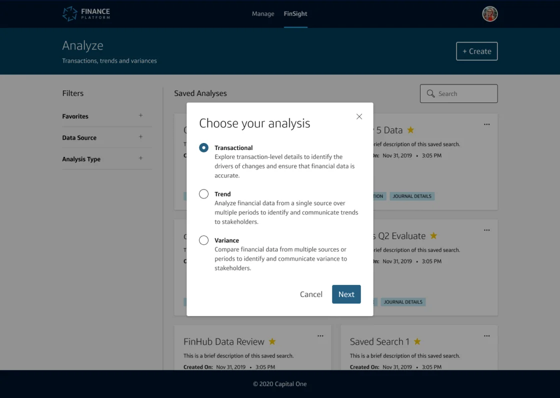
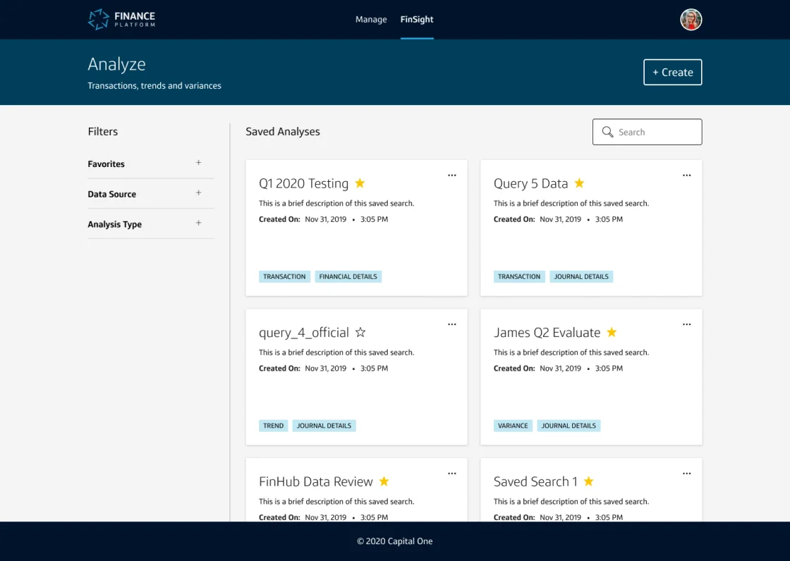
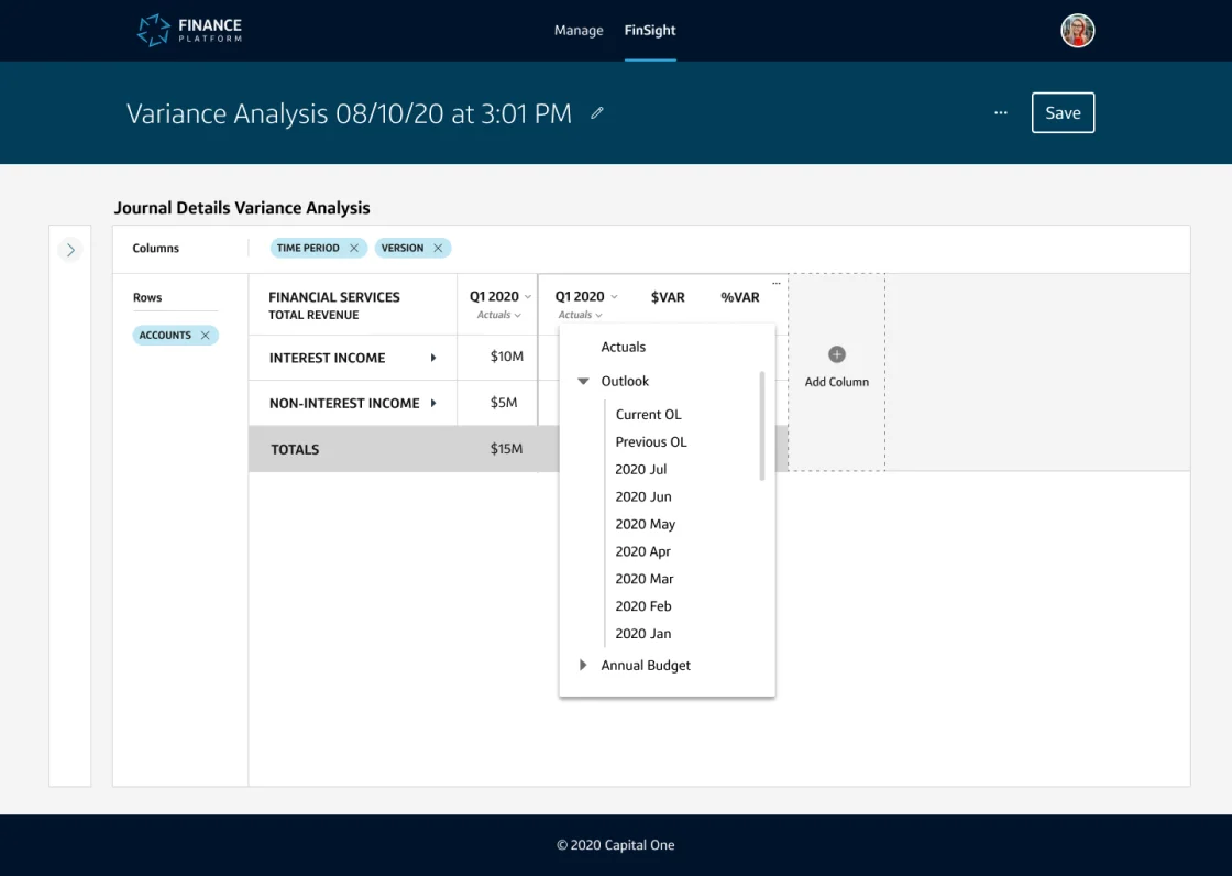
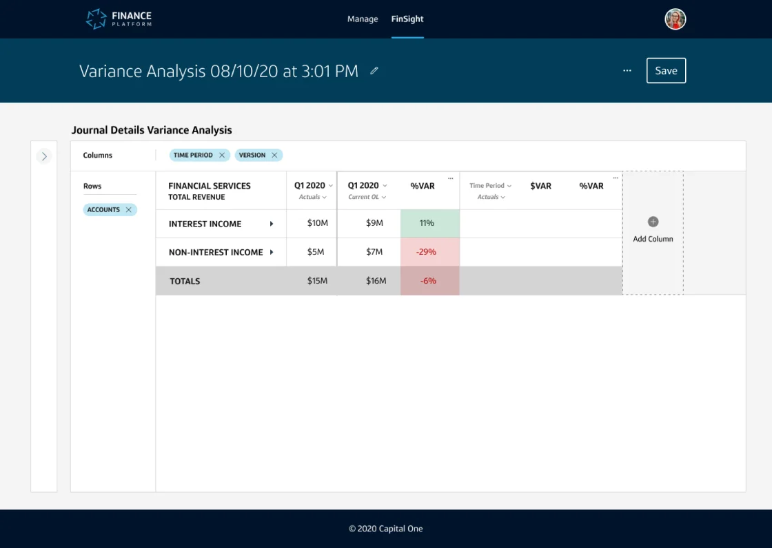
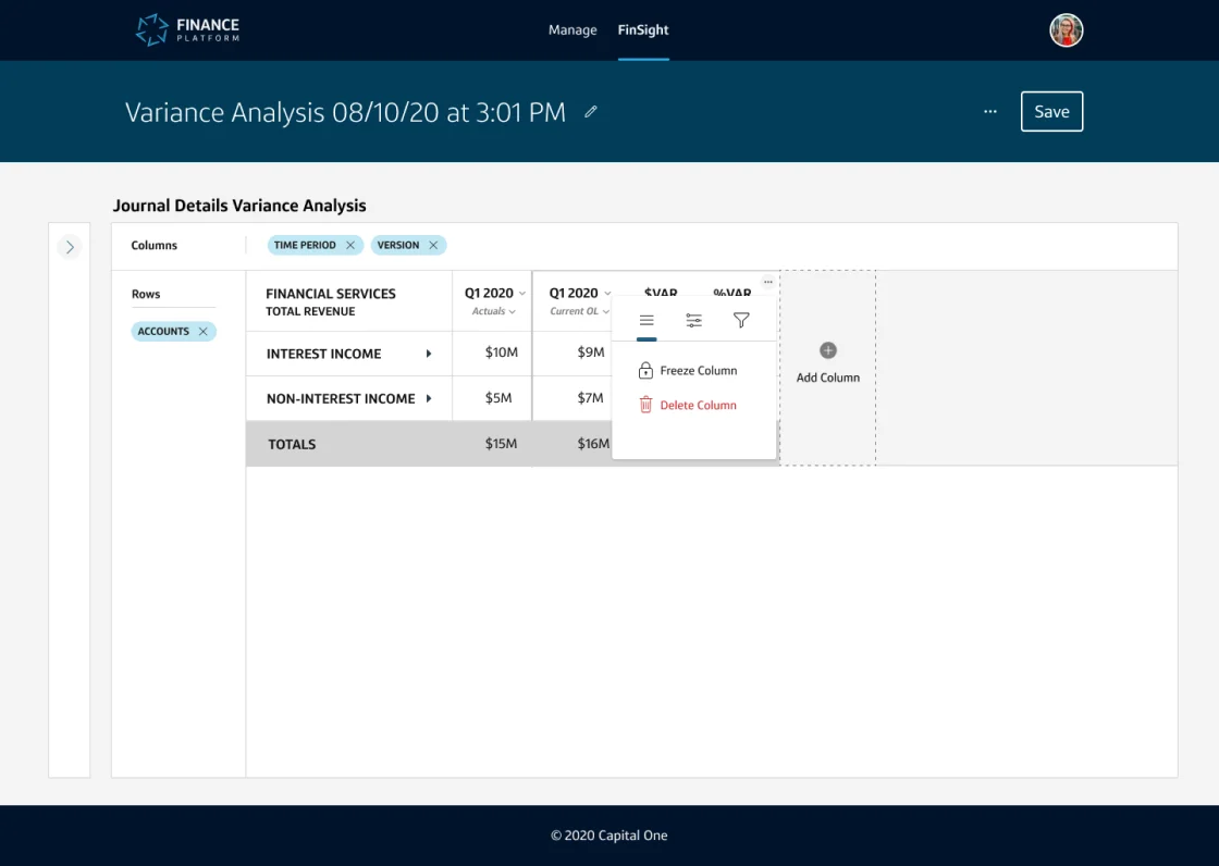
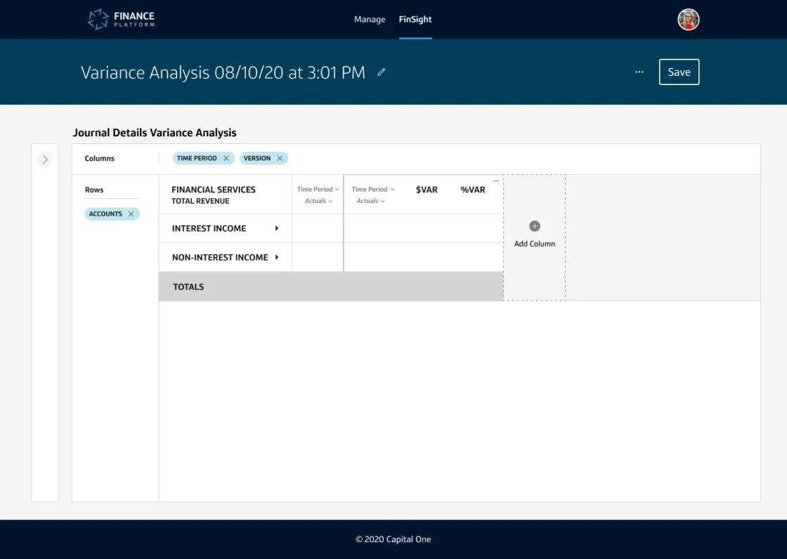
Some select screenshots of the final Analyze experiences.
When writing this, the team delivered the first MVPs for the Transaction, Trend, and Variance experiences. Next up for exploration is building upon the foundational work that we delivered. We’ll be looking into data visualization, commenting, sharing, and templatizing analyses so that they can be widely used across the Finance organization.
Circle of Excellence
In early 2020, the Analyze experiences we delivered were nominated for the Circle of Excellence, Capital One’s highest associate honor. Only a select few teams were chosen for this award each quarter, and to my delight, we won for Q2 of 2020. We had the honor of meeting our CEO (remember, Capital One has 50,000+ associates, so this is a big deal) and got to share our product with him. It was the capstone of an excellent product delivery.
The work we shipped was eventually given a sub-brand within the Finance Platform – it became known as FinSight, short for Finance Insight. We developed a logo for it that spread widely across the Finance organization by means of t-shirts and other swag.
Our experiences, dubbed “FinSight”, powered by the Finance Platform.
Overall, I felt that FinSight was a great example of how Design, Product, and Tech could work together, respect each other, and bring various talents to a project and succeed.